We all know about how websites can draw in customers for business but many web developers do not understand the concepts of responsive web design and the benefits of carrying out this modular approach.
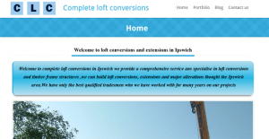
Looking at websites on different devices we can see the obvious benefits of learning these new skills I personally have had to build separate applications for different media so understand from the outset that using frameworks like twitter bootstrap can benefit the developer, client and user of the system. The same web design principles still apply but to build two separate systems for one goal just so they are legible on a phone is madness so I decided to take the plunge and build all of my websites with a responsive framework and also bend wordpress to come within these rules so the SEO and blogging platform were intact and readable on any device.
This is not easy but the results are delightful and once you have used wordpress with twitter bootstrap there is no going back , after building separate apps with Jquey mobile and eclipse studio you realise that building applications in this way covers all the bases so no more duplication of code or design one size fits all.
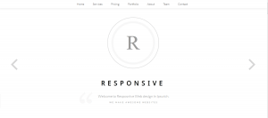
The grid frameworks align the content so it looks pretty on a phone or an I pad and the menu system changes to suit the browser orientation or size.
Reaction to the changing world of web development is why I enjoy new techniques and learning new ways of doing the things I already know how to do.
I will be looking into some more responsive frame works in the coming weeks until then happy coding.


